Pan Am: The New Age
Brand Revitalization
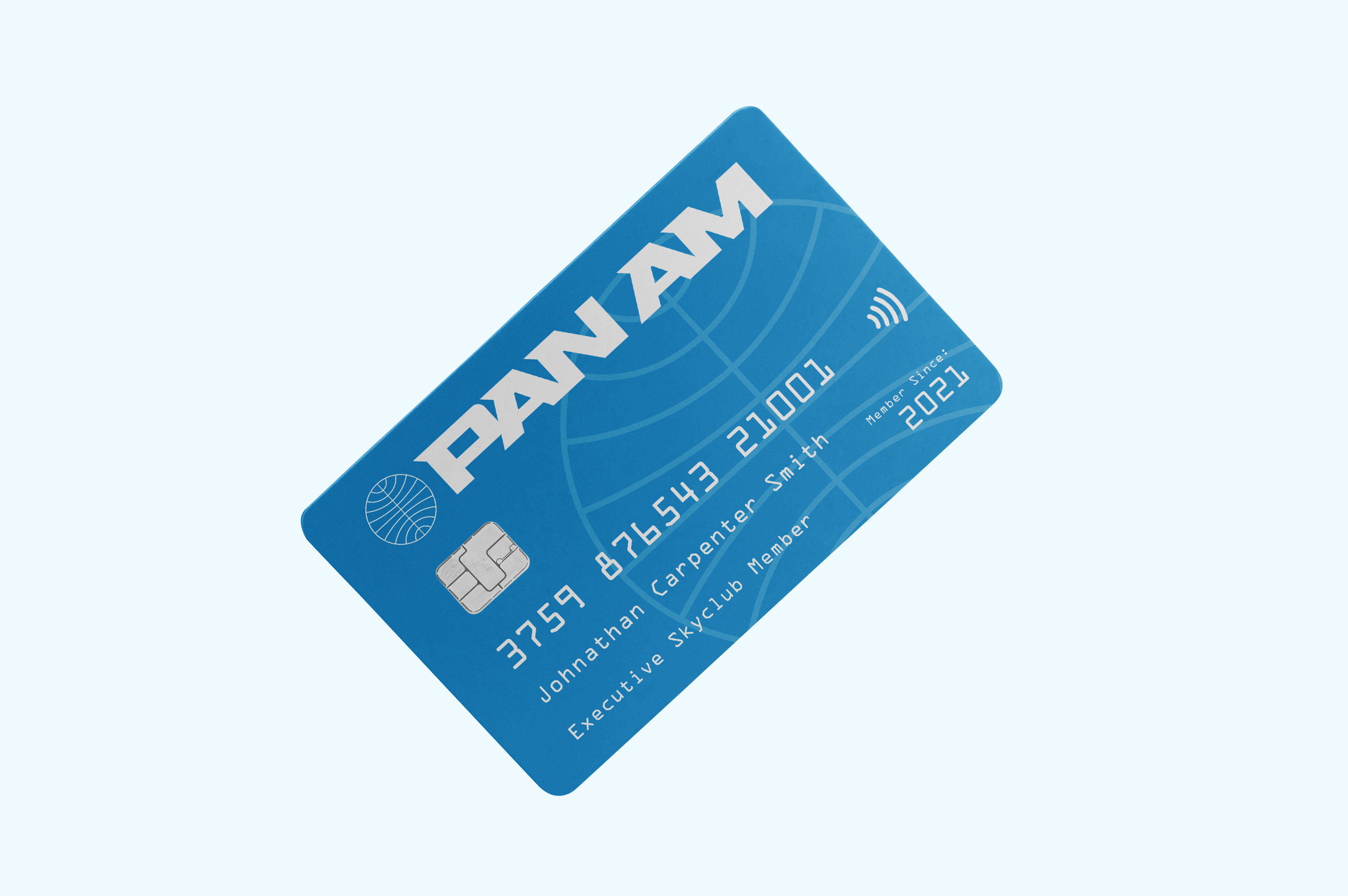
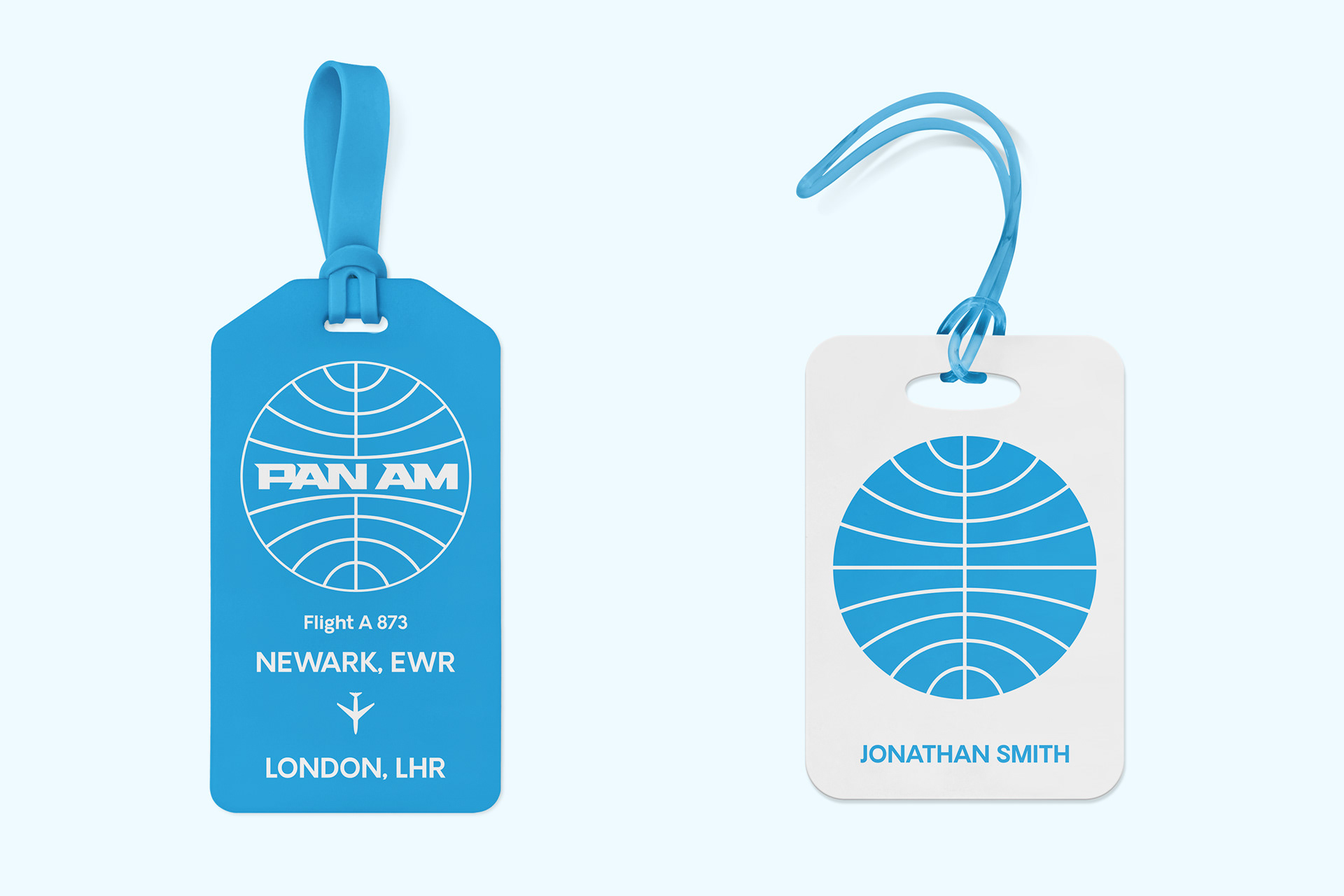
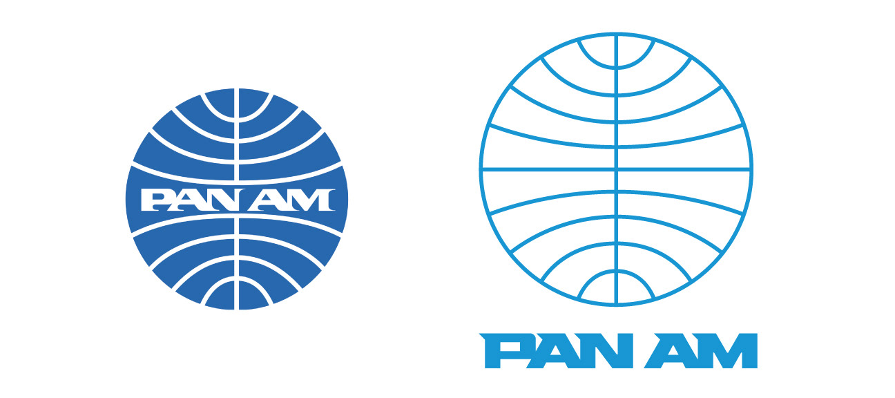
The original Pan Am logo that you know of was designed by Charles Foreberg, Edward Larrabee Barnes, and Ivan Chermayeff in the mid-1950s. This symbol was meant to define the company’s drive and ambition and its overall pioneering spirit. In the 1970s, the logo was updated again to what most people recognize today, this version is based off that updated design with thicker lines and connected logotype.
To recognize the original design contributors, I only updated logo's typeface to something more modern and easier to scale.
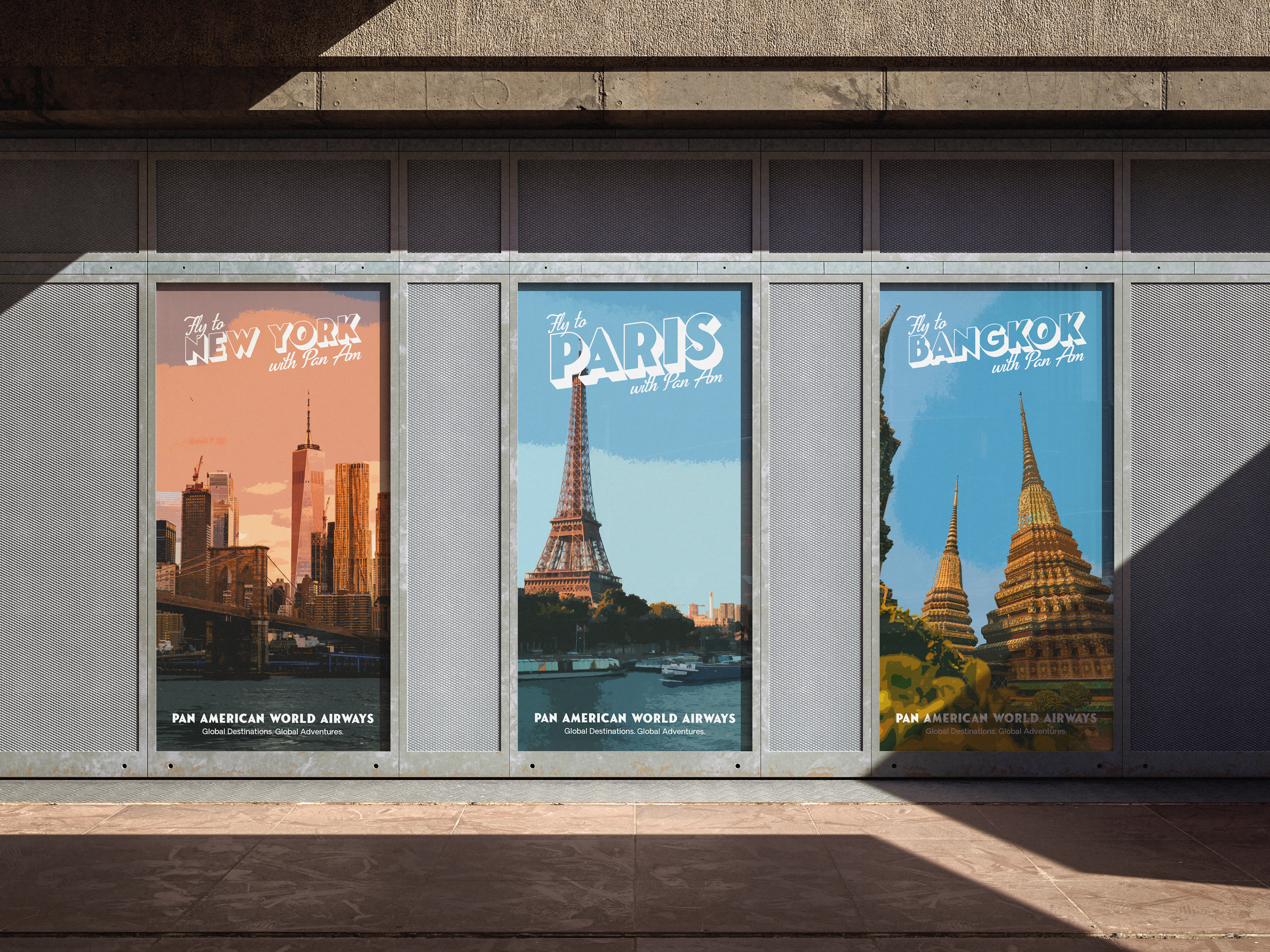
Pan Am was once the largest and most notable airline in the world. After its demise in 1991, most of its assets went to other airlines and the iconic brand was retired. Although the desire to travel in style has never left. Many airlines have shifted away from giving a quality experience to the average flyer that airlines were once known for. Instead, scaled premium services are offered to consumers at an increased price point. With most people opting for Economy Class, air travel has become such a mundane experience to the point where it is seen as just another public transport option.
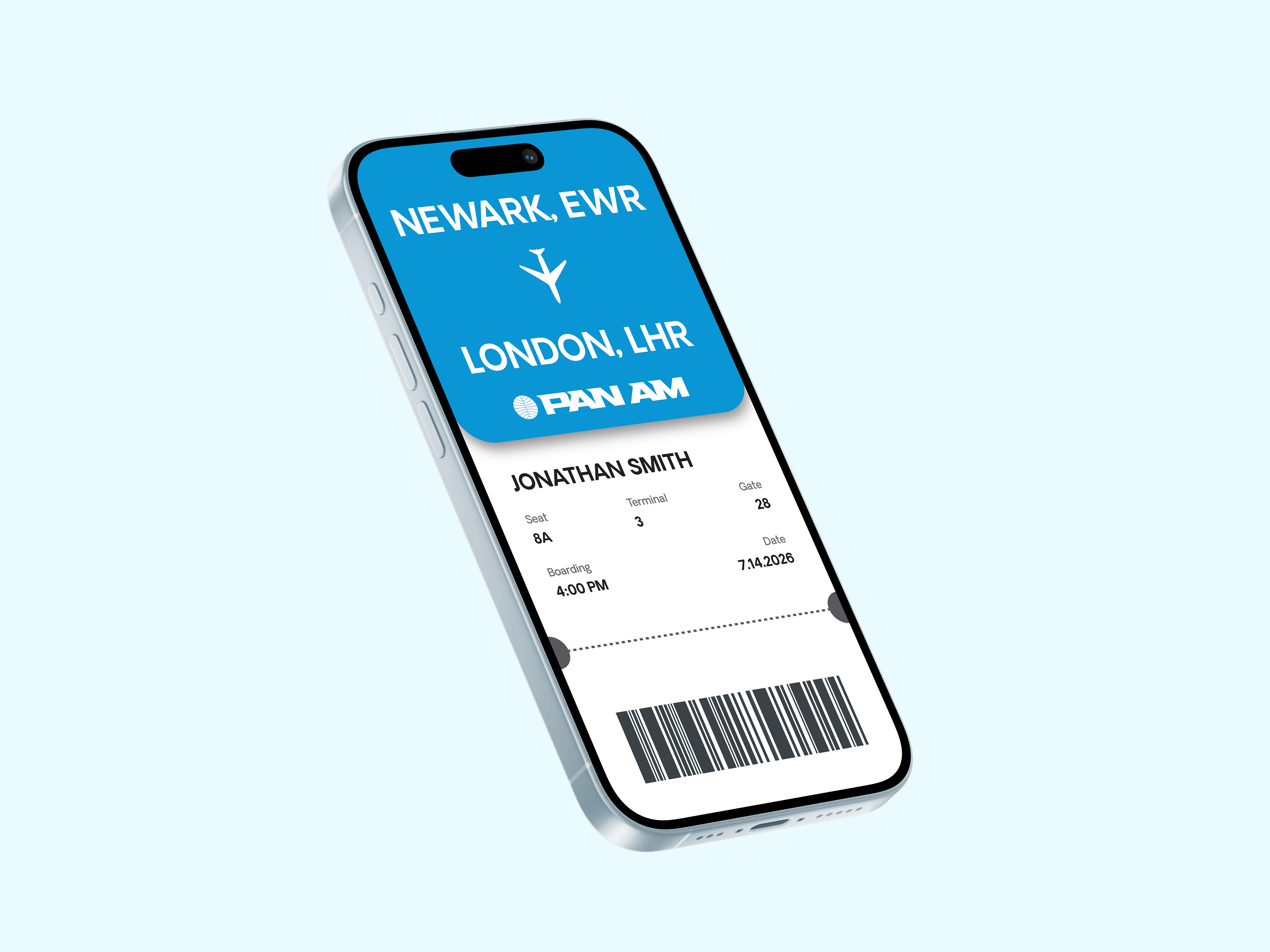
As a revitalized brand, my aim was to bring back the luxury of flying to the normal consumer, without the high prices of their competitors. I originally worked on this project in 2016 and then updated it in 2021, and finally updating it once again in 2026.
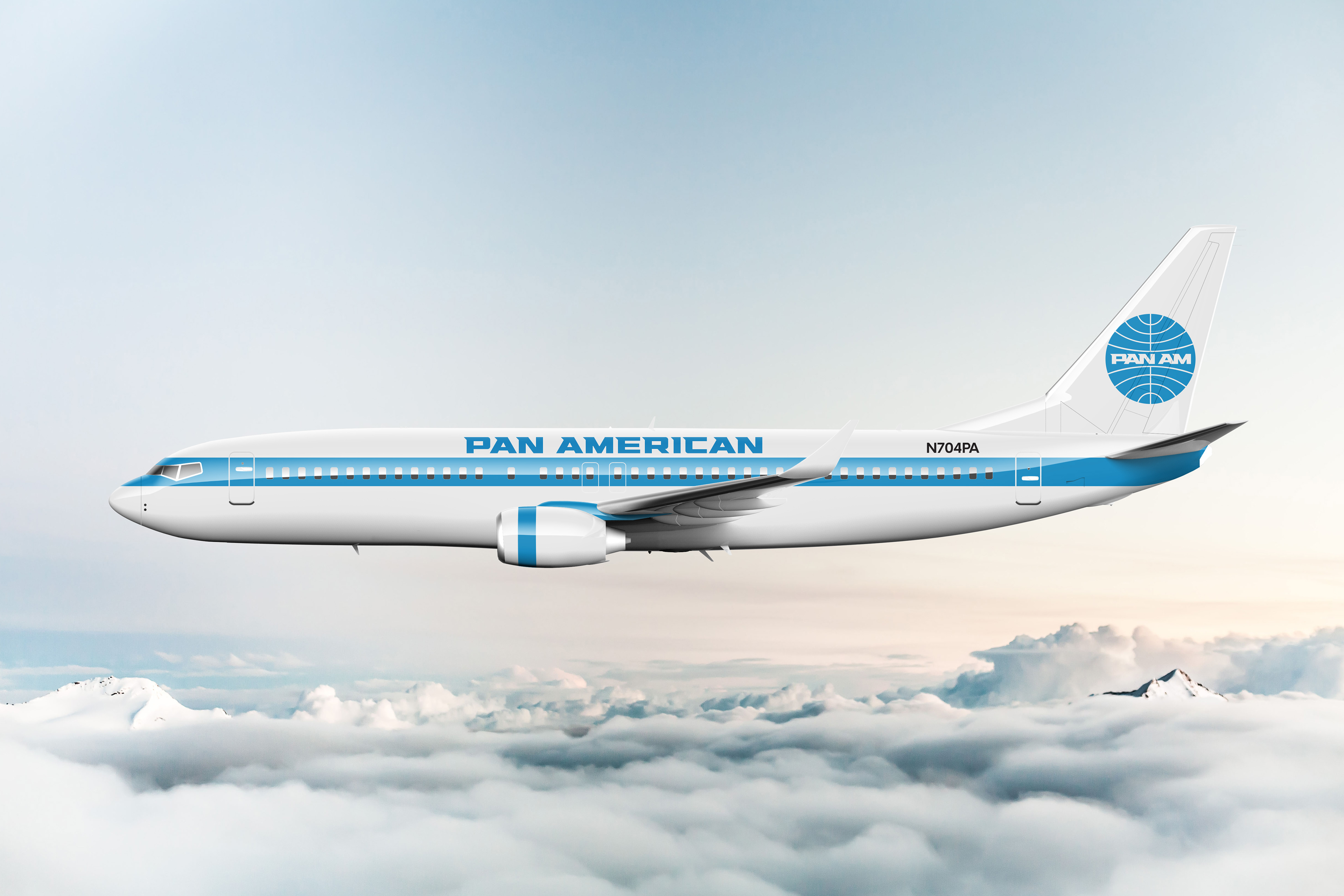
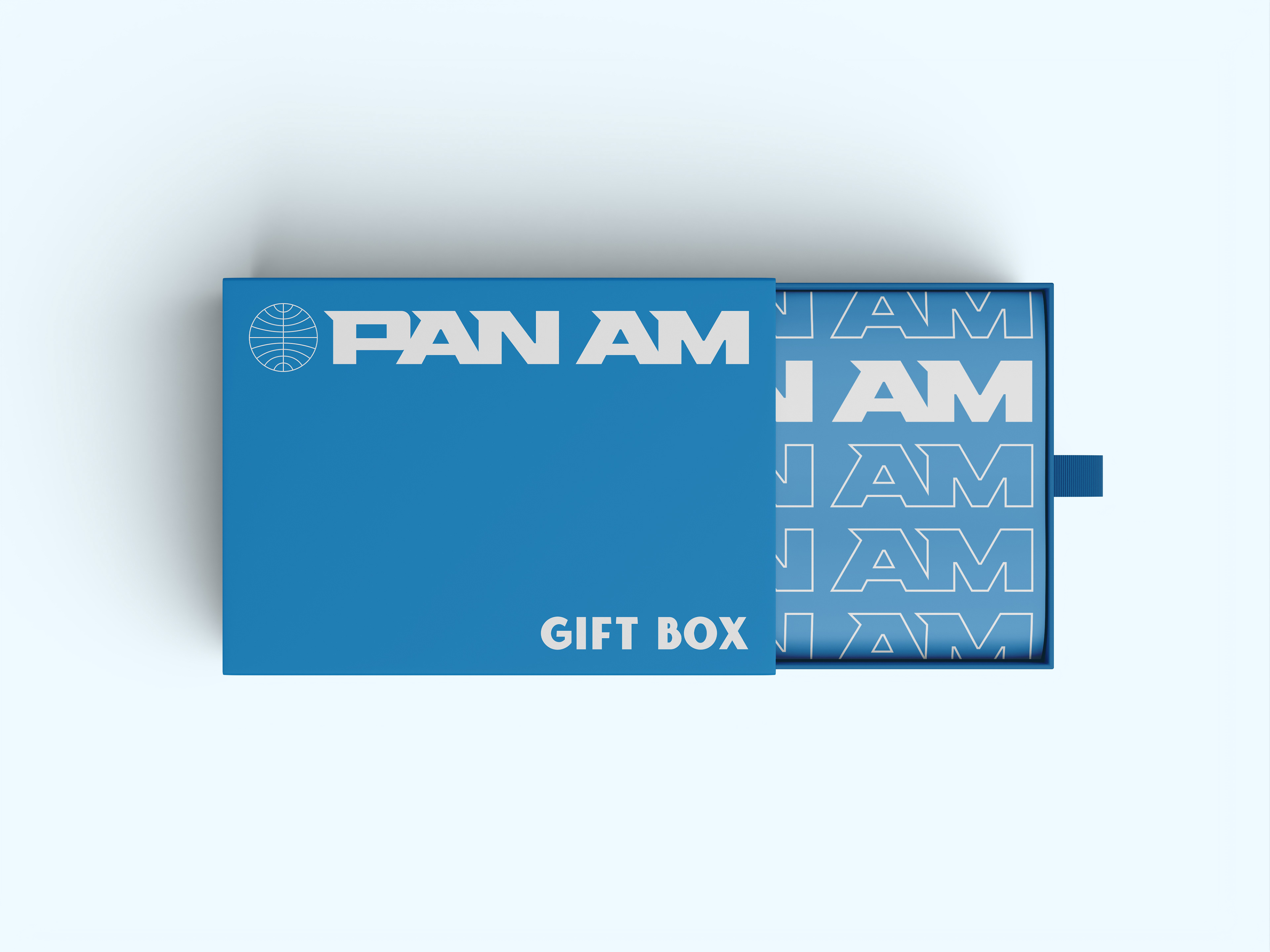
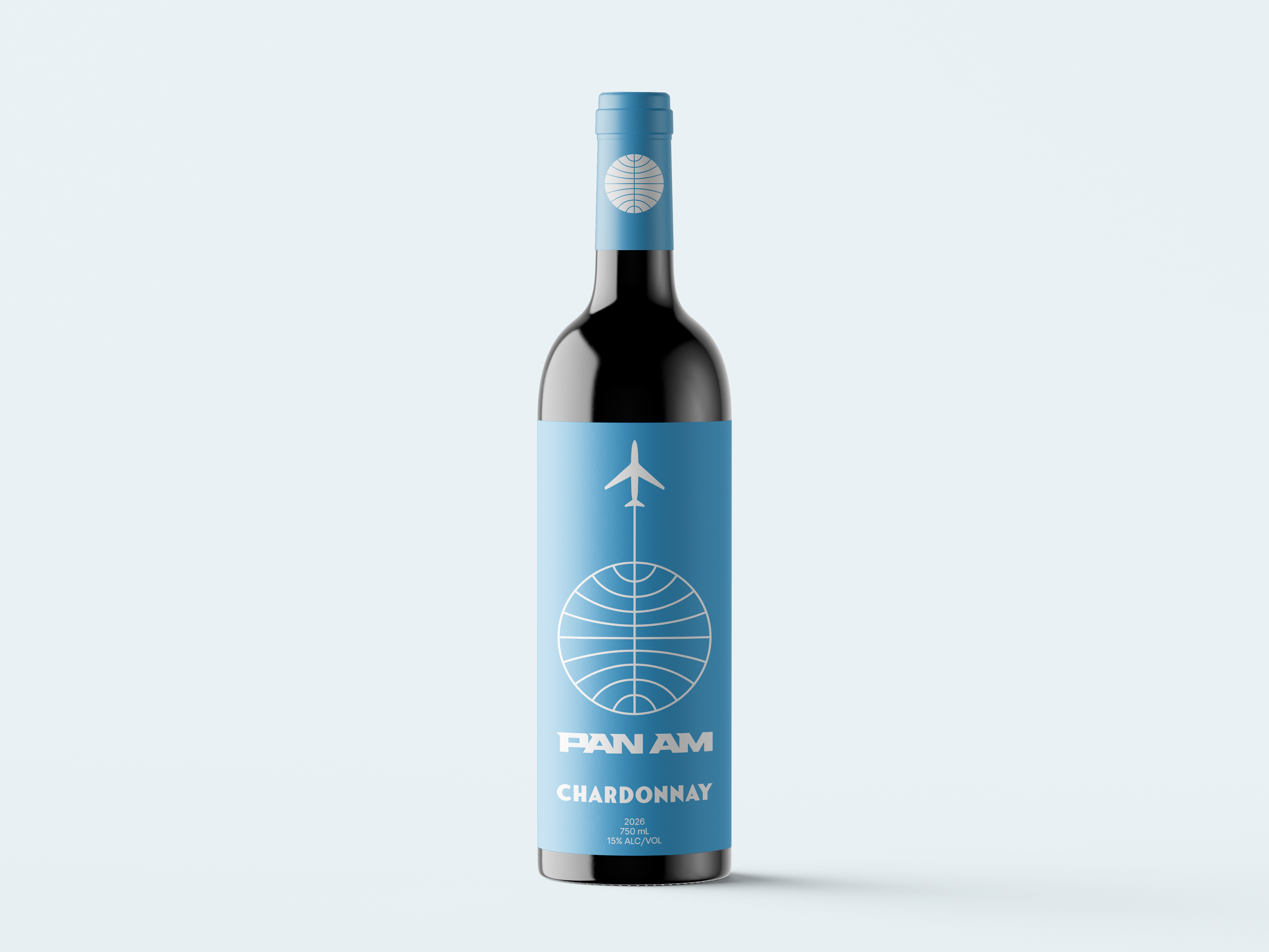
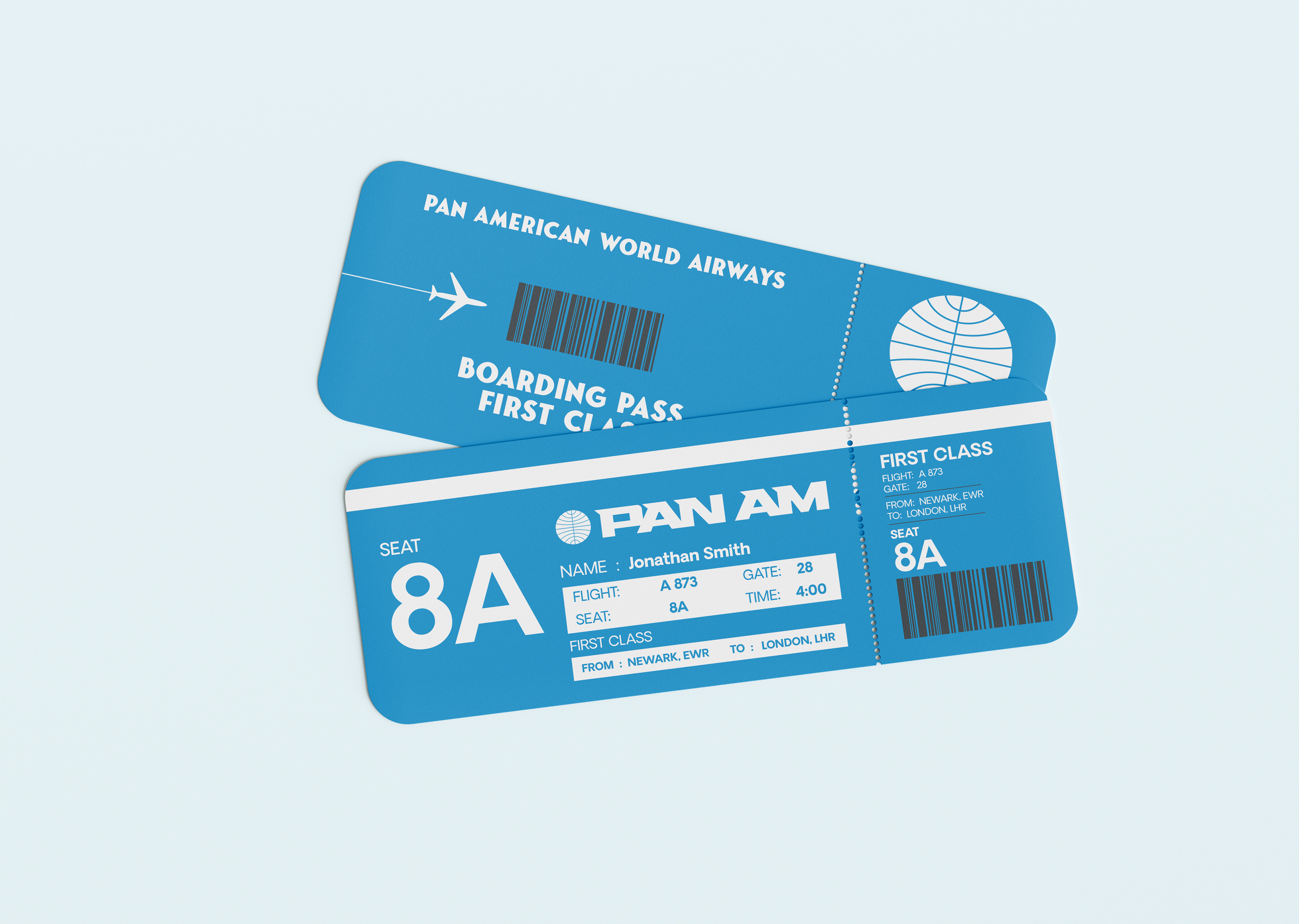
The rebrand centers on typography, replacing Pan Am’s outdated system with a typeface that honors its windswept roots while improving clarity across modern platforms. Hunterra became the new logotype, offering a bold, distinctive variable style, while Fonseca Grande adds expressive character for posters and titling.
To acknowledge Pan Am’s 1980s shift to Helvetica, I introduced Oakes Grotesk as a more legible, contemporary alternative for body text and headings. Together, these typefaces create a modernized identity that respects Pan Am’s history while delivering a clearer, more confident visual direction.