Four Corners
Visual Brand & Identity Creation
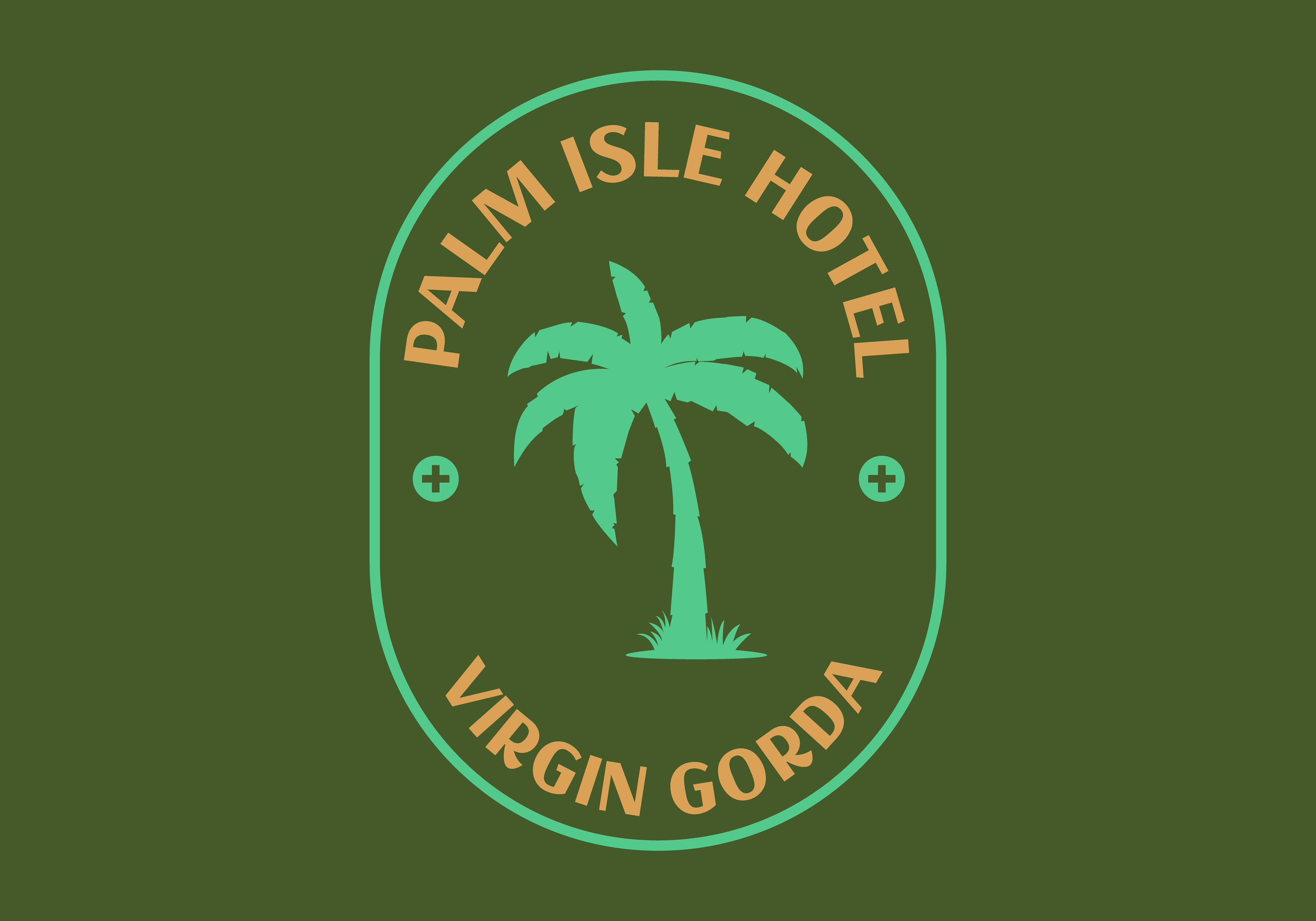
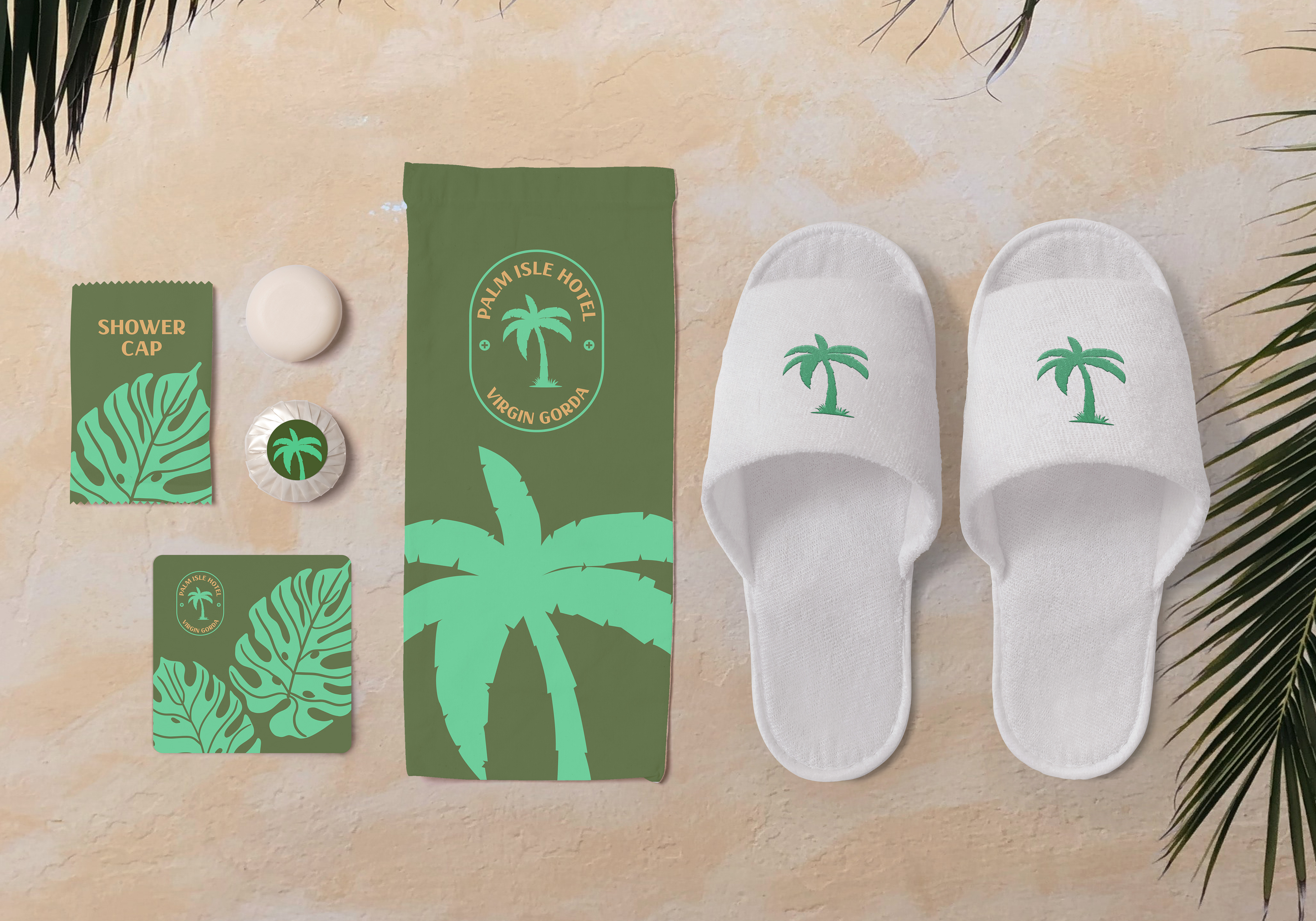
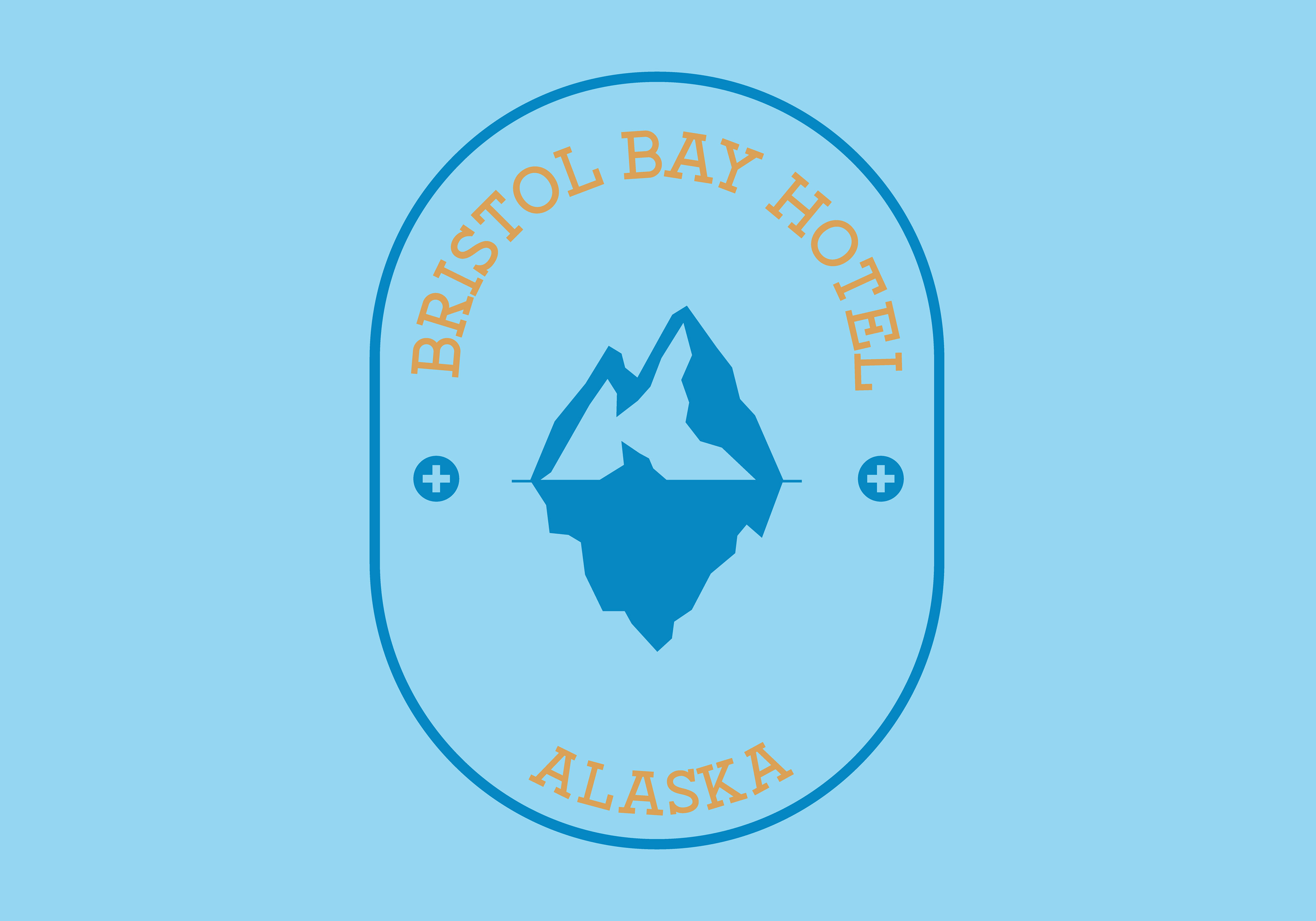
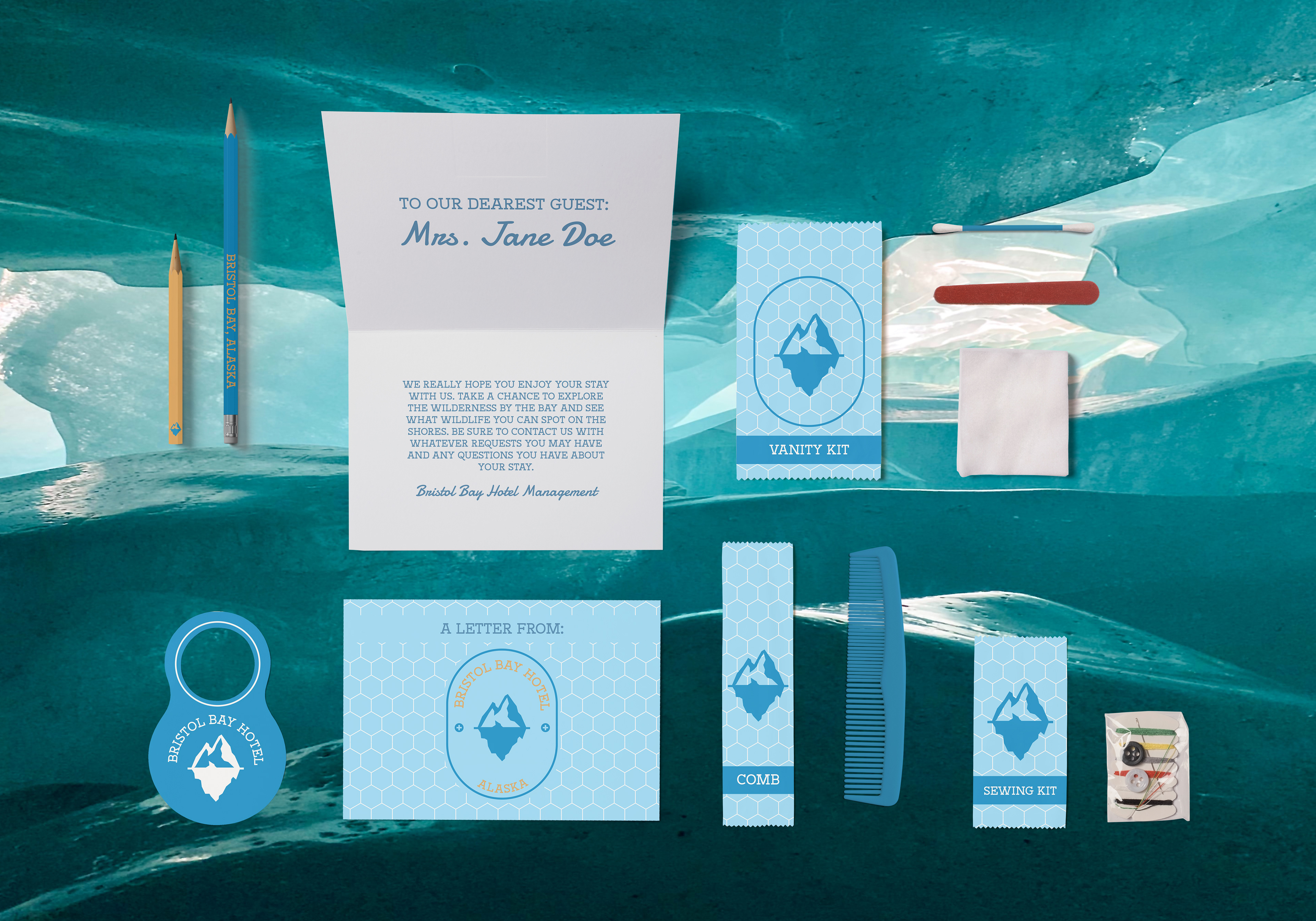
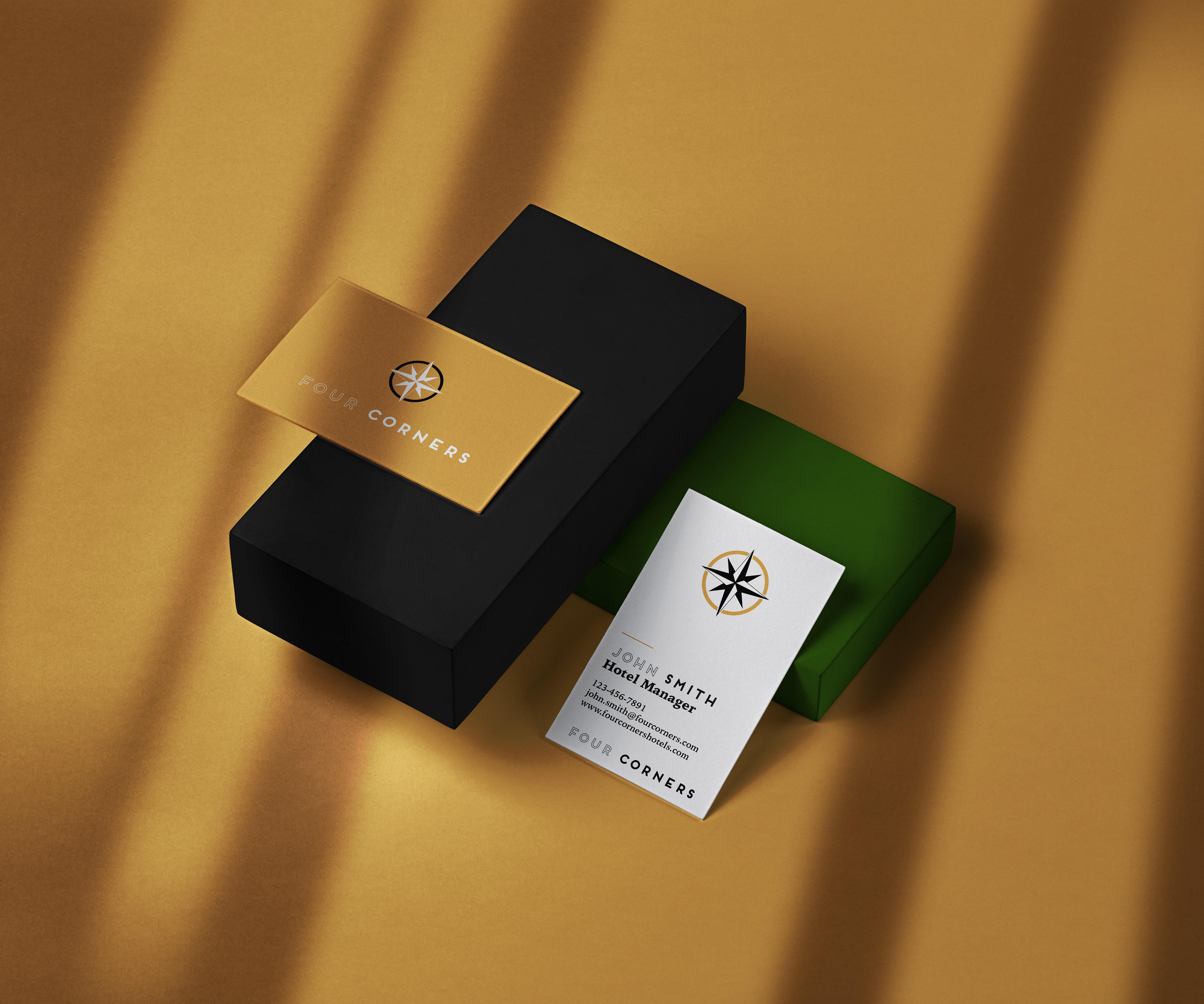
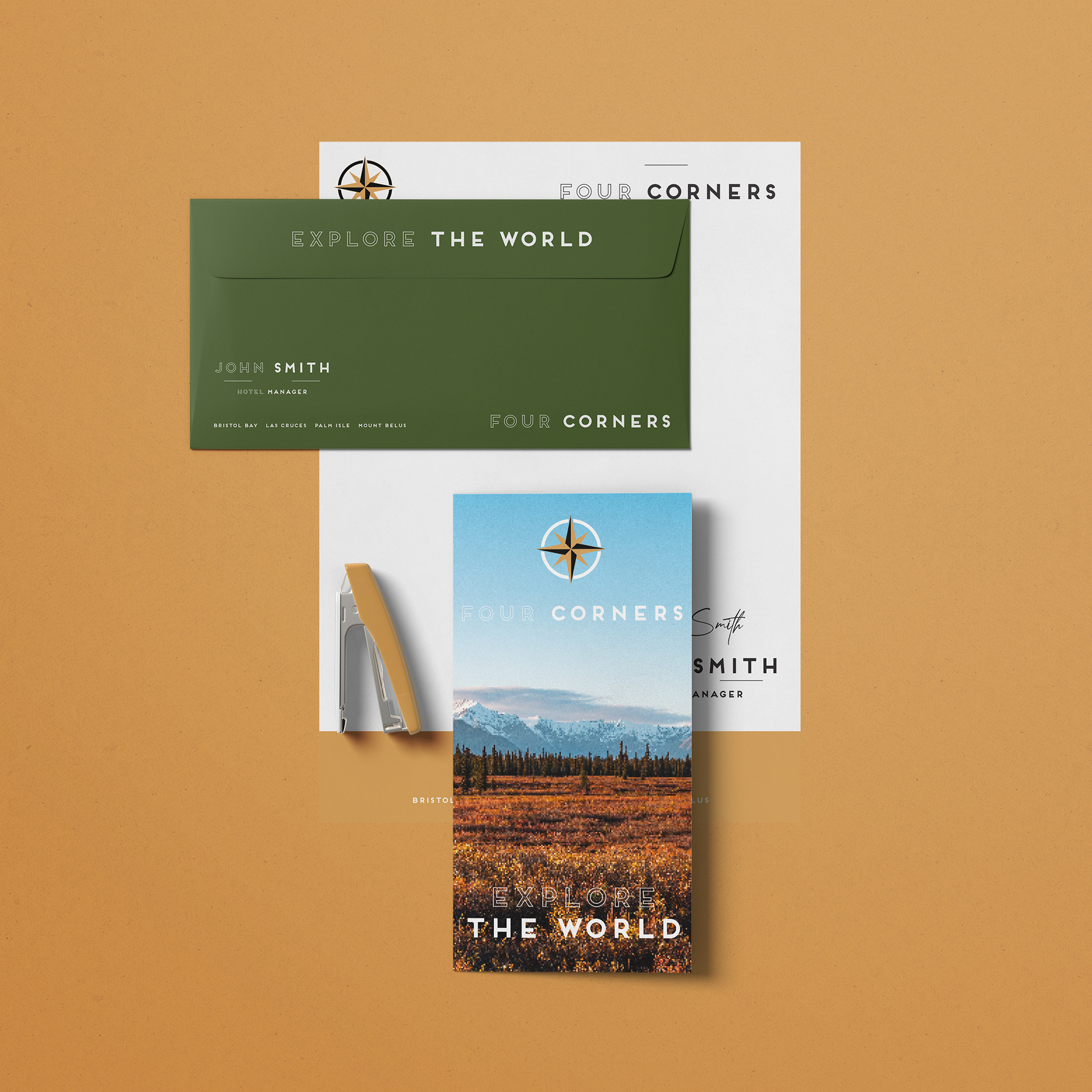
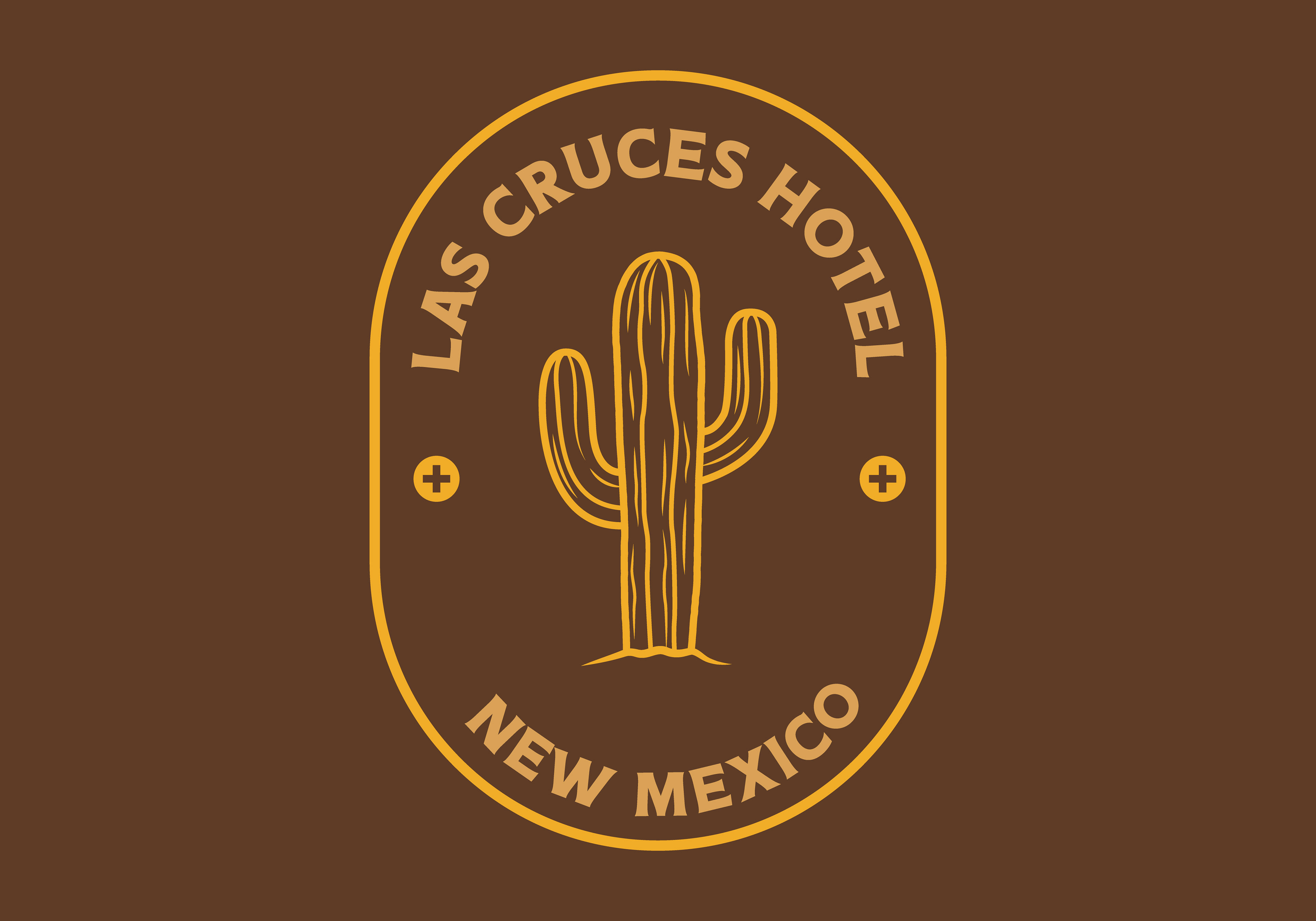
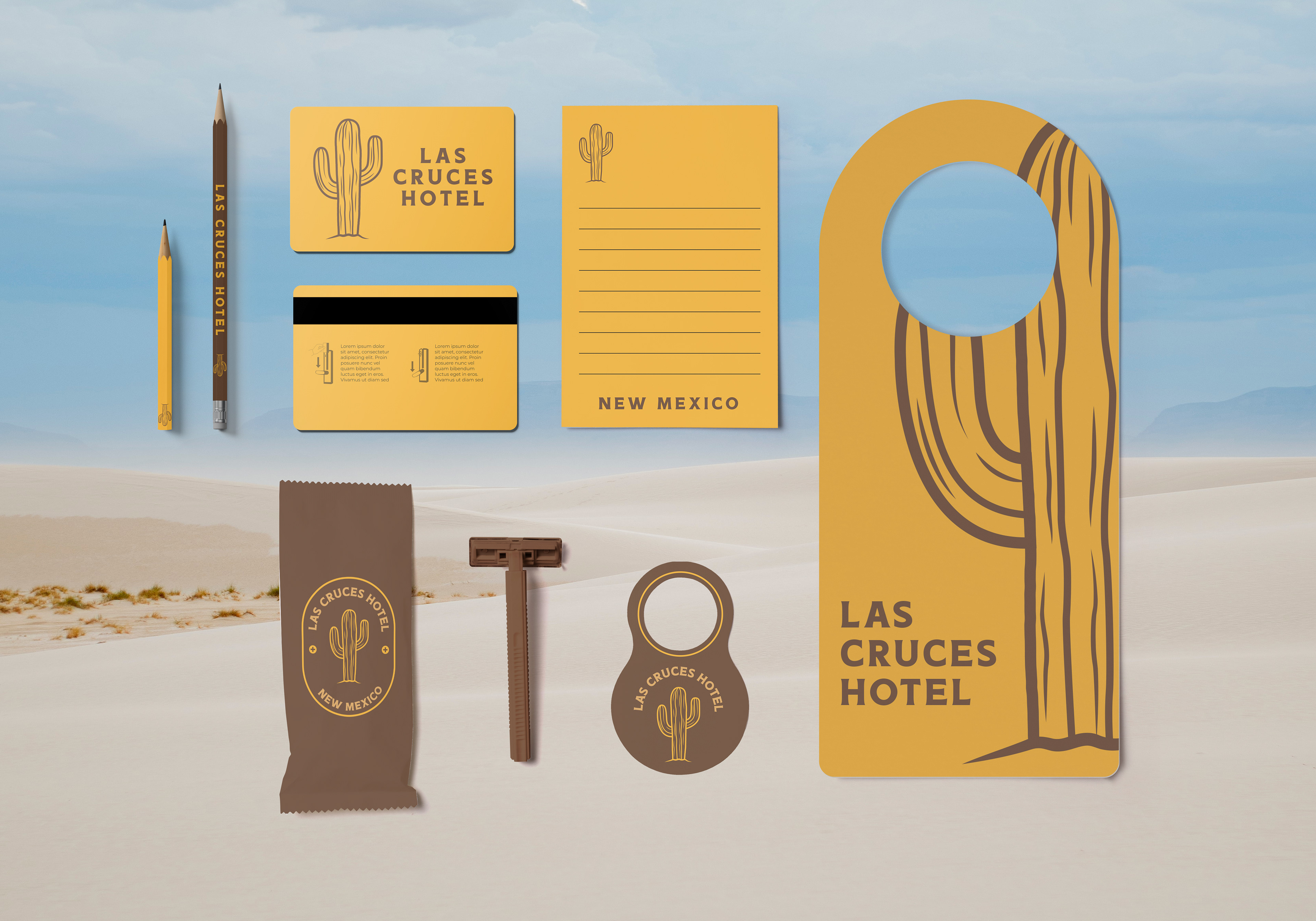
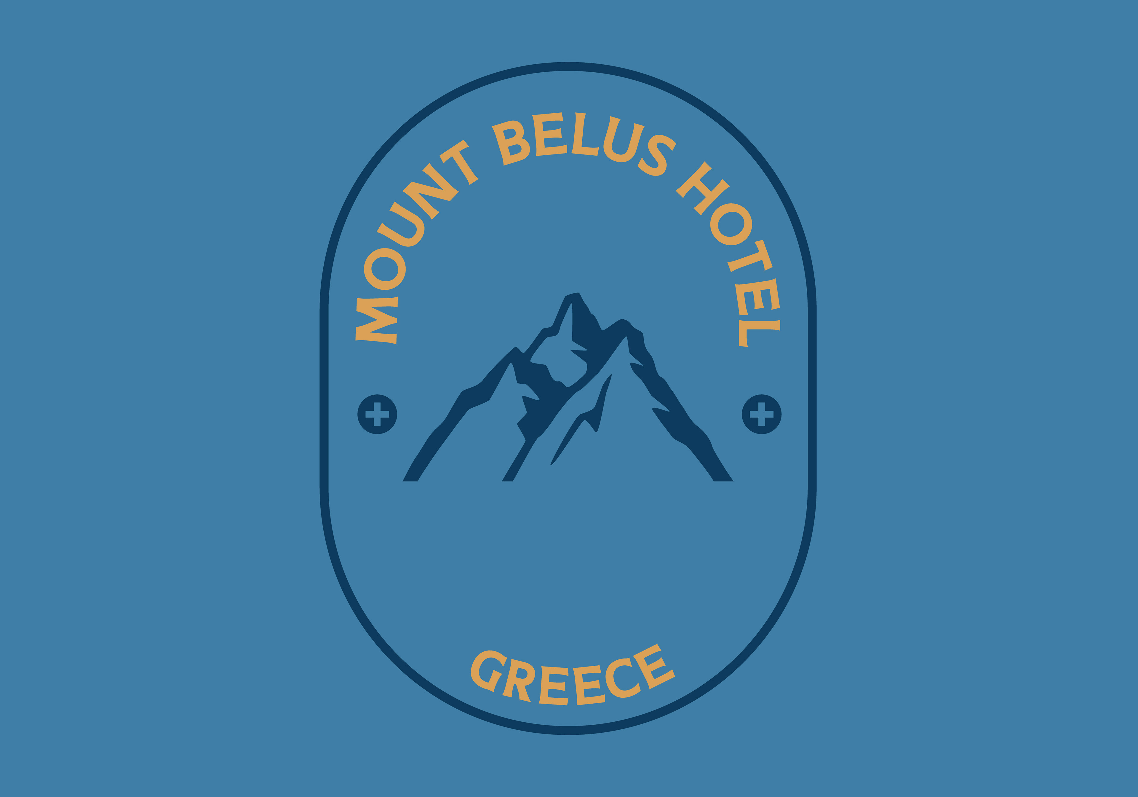
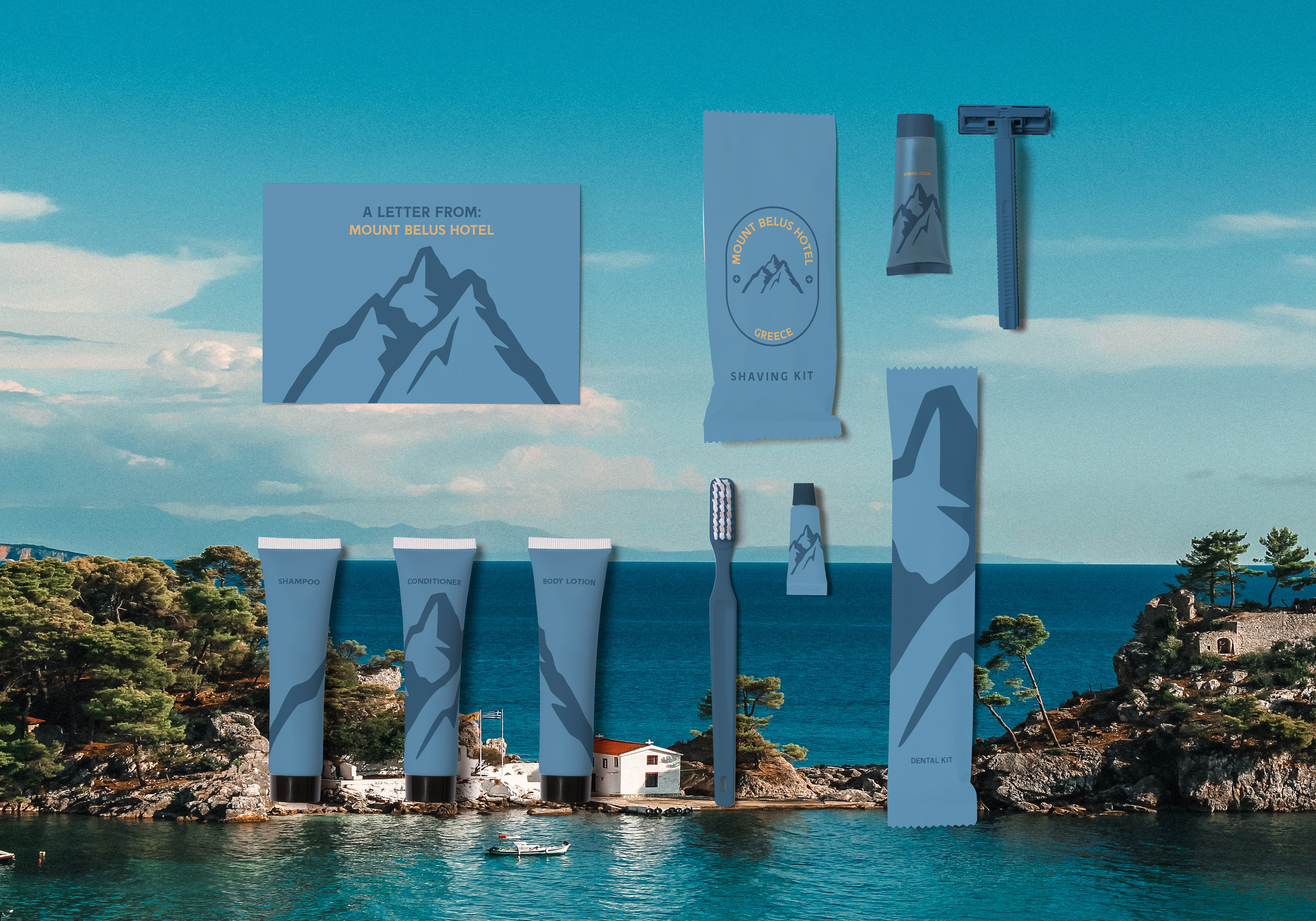
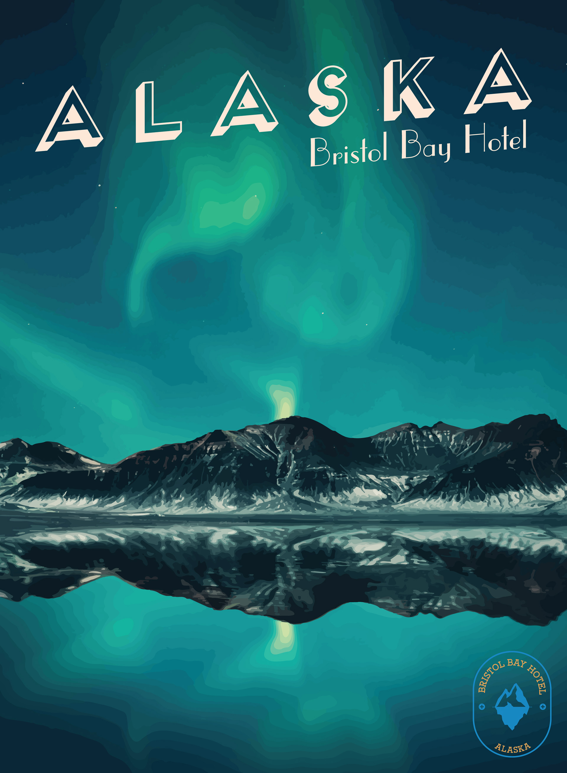
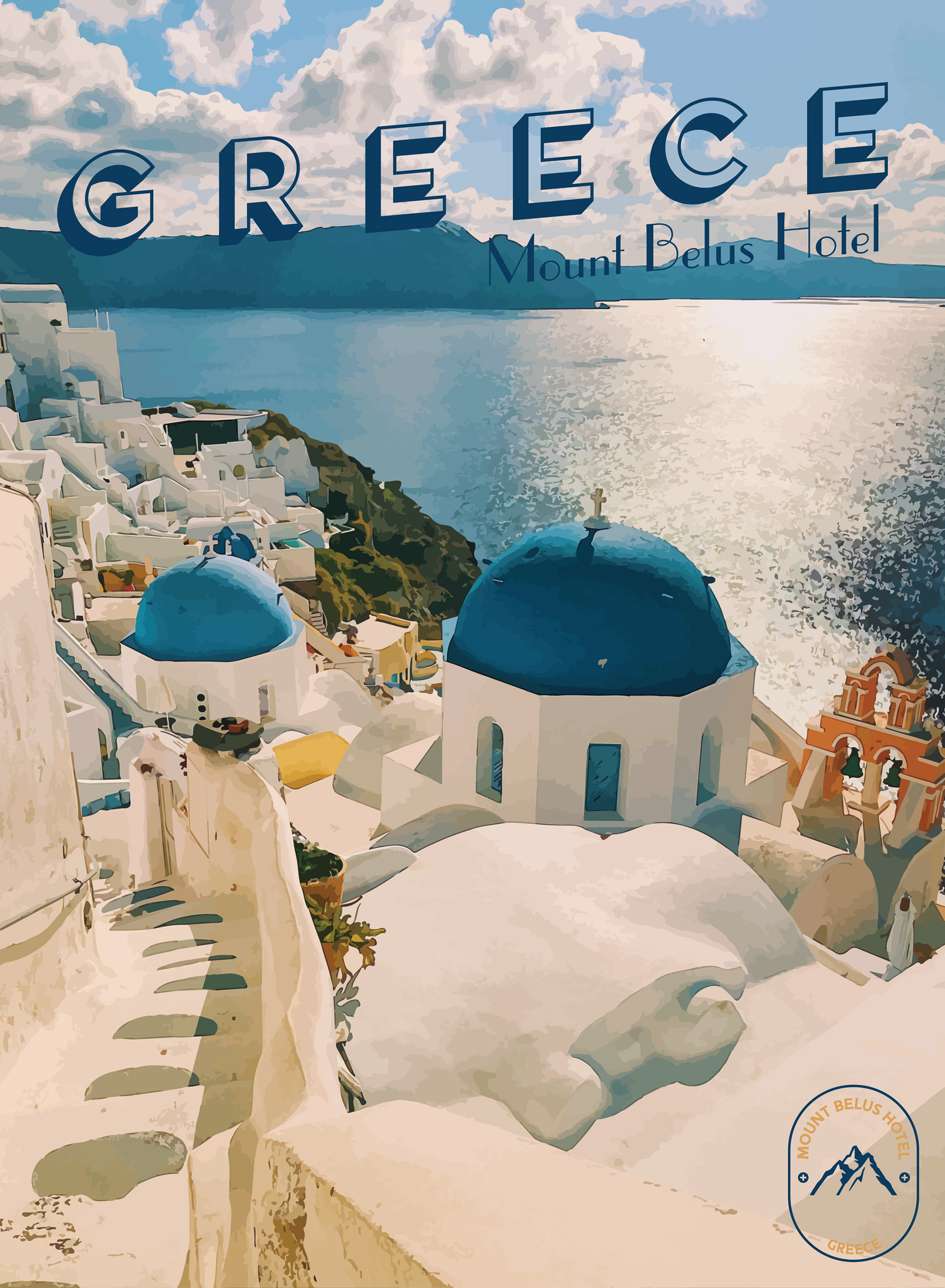
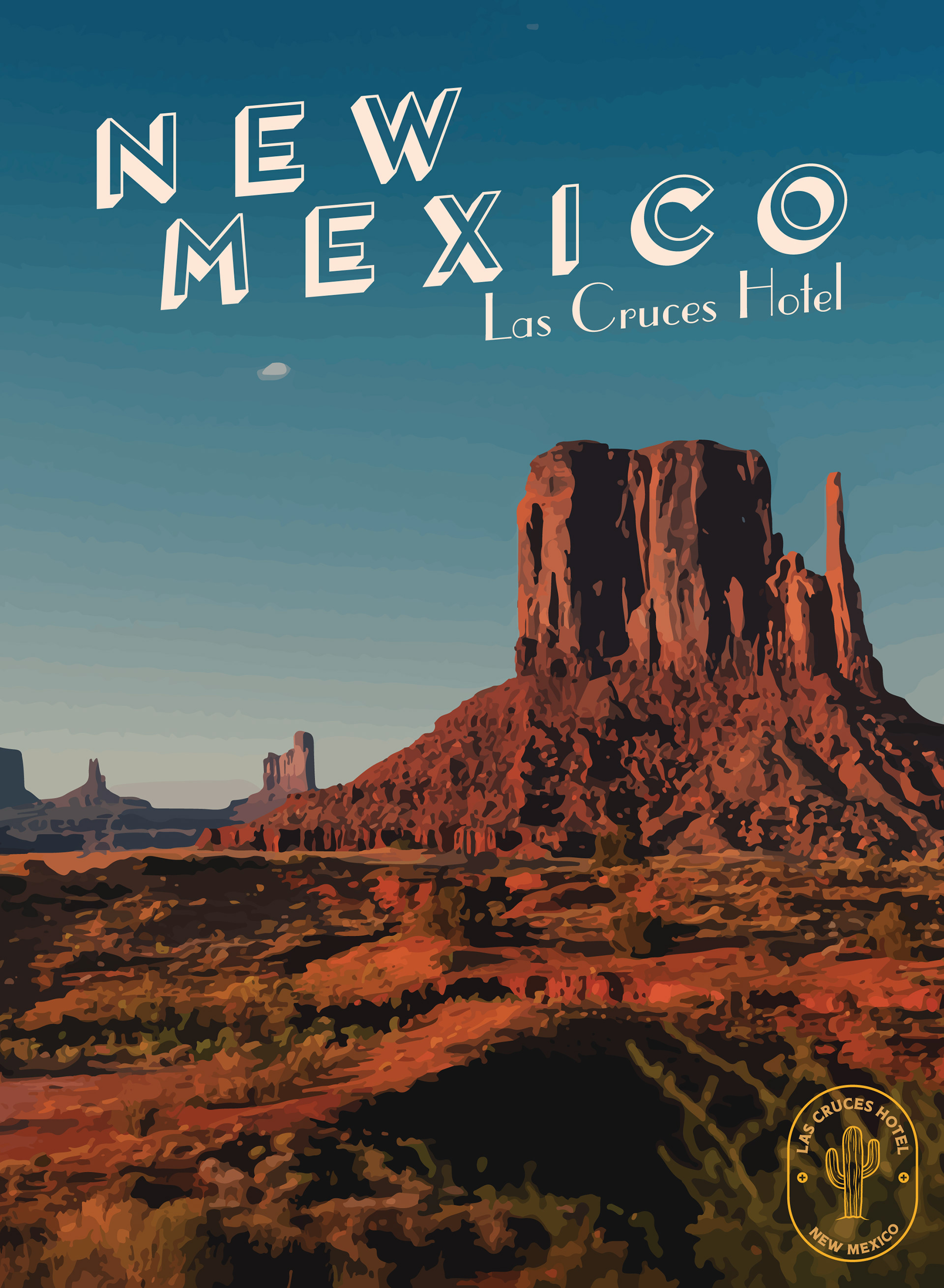
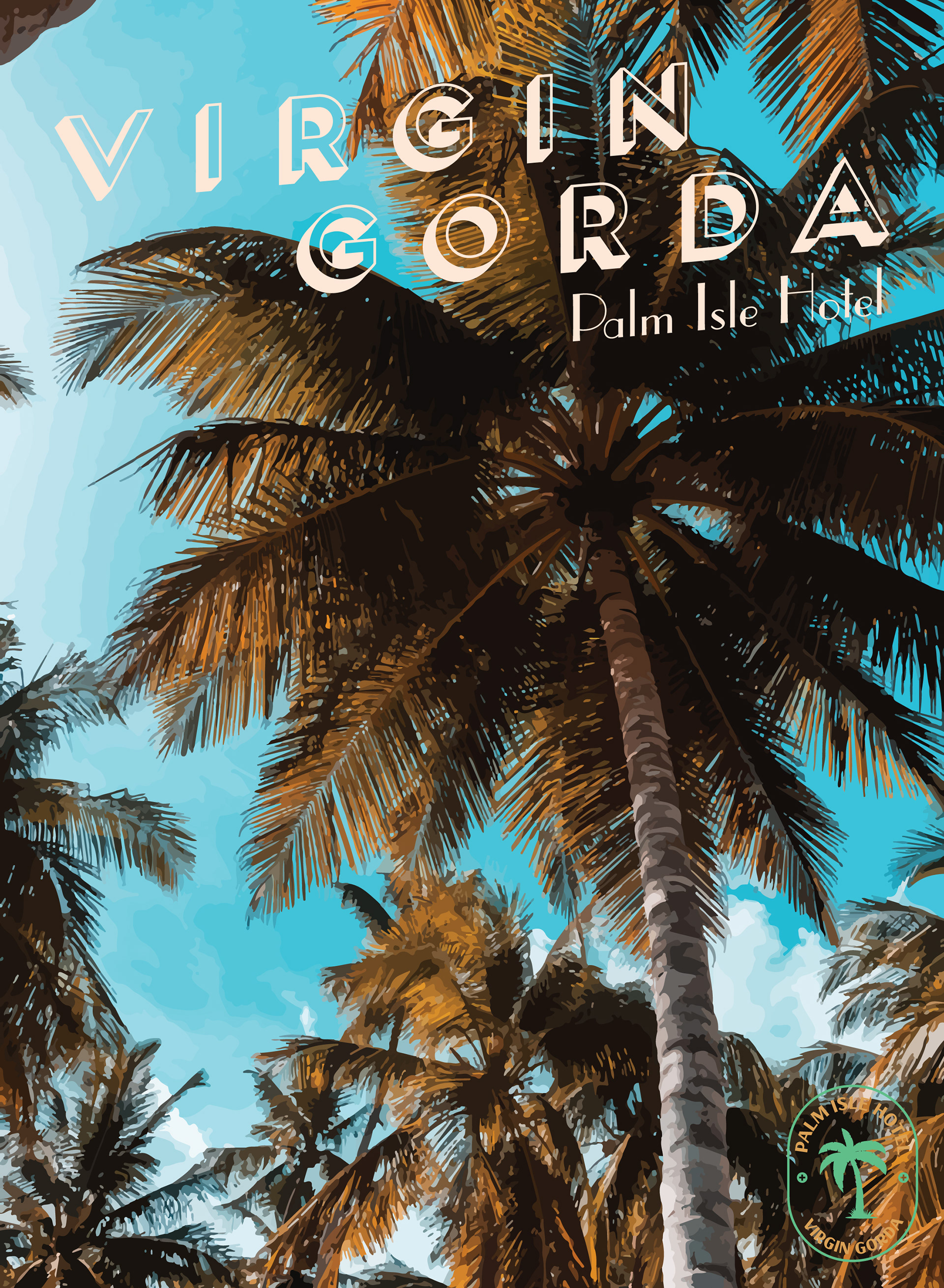
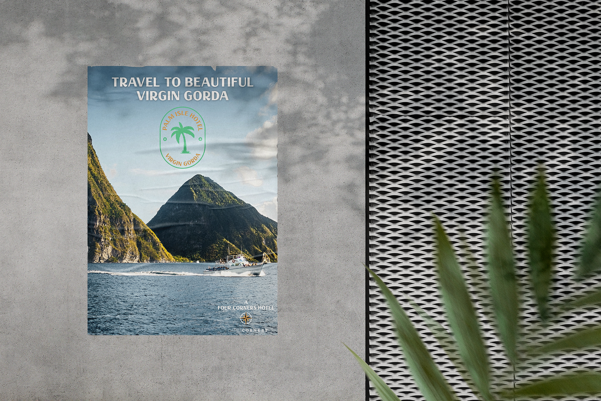
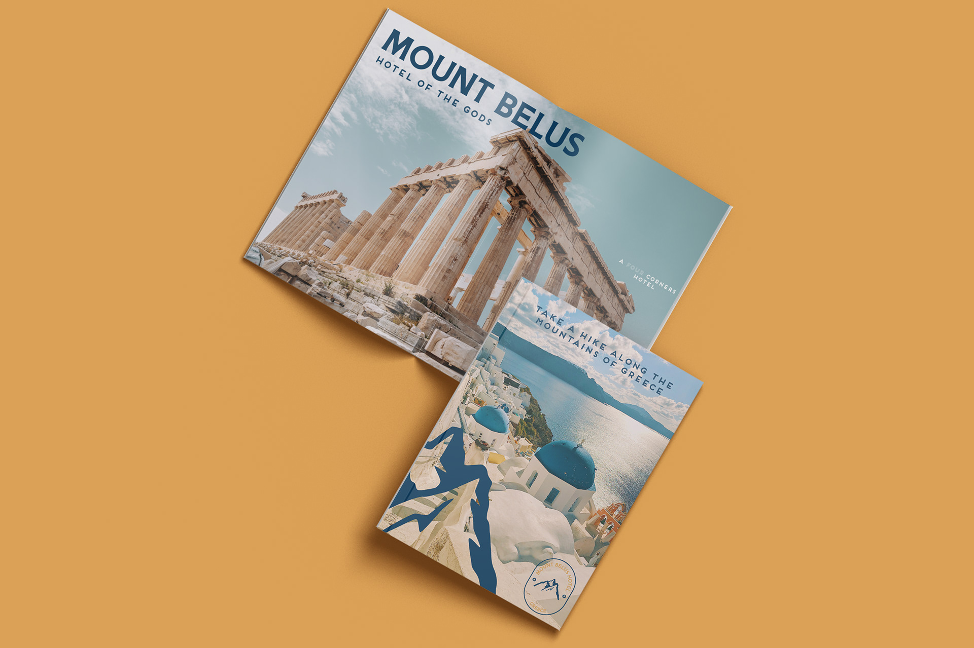
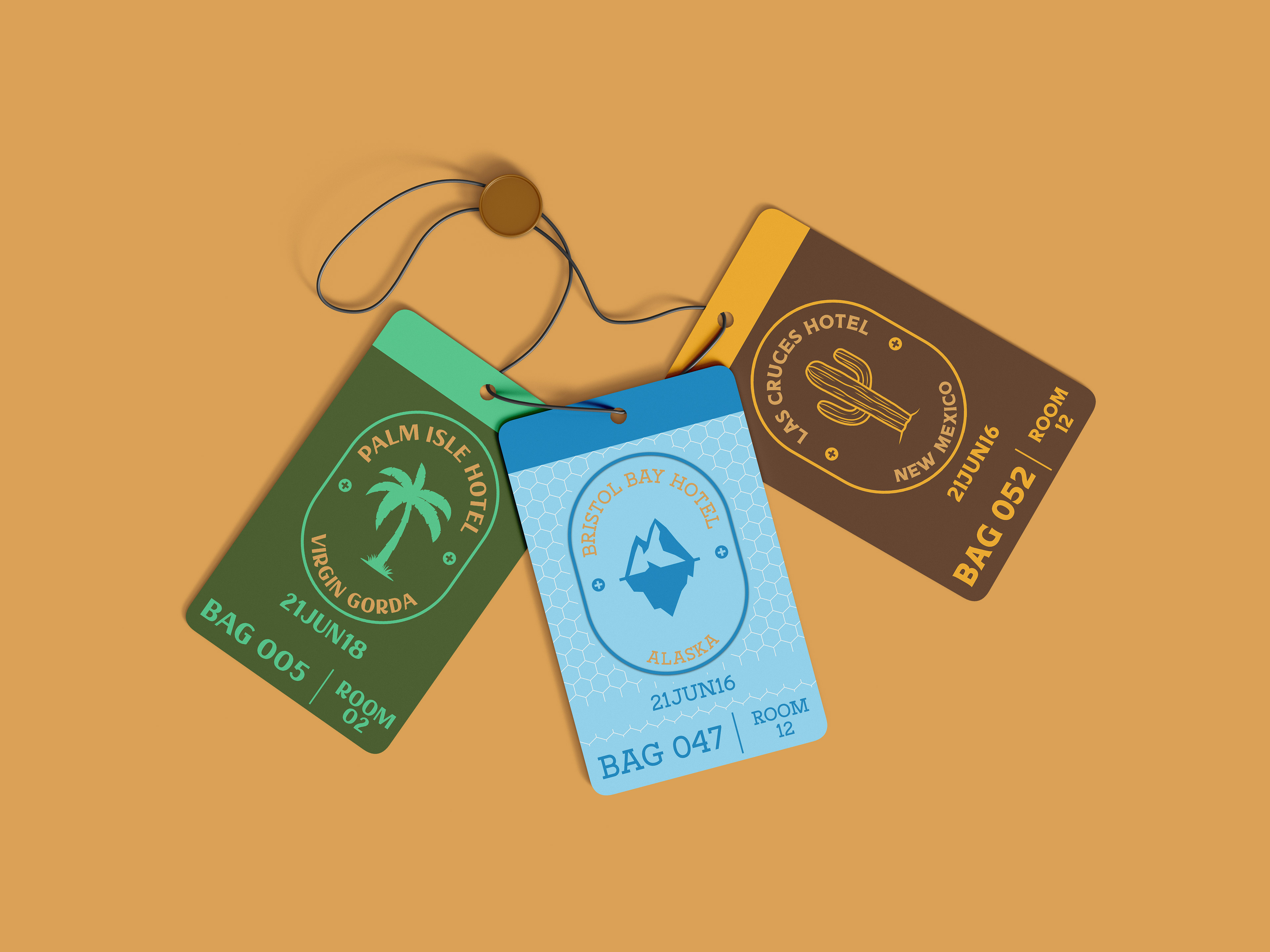
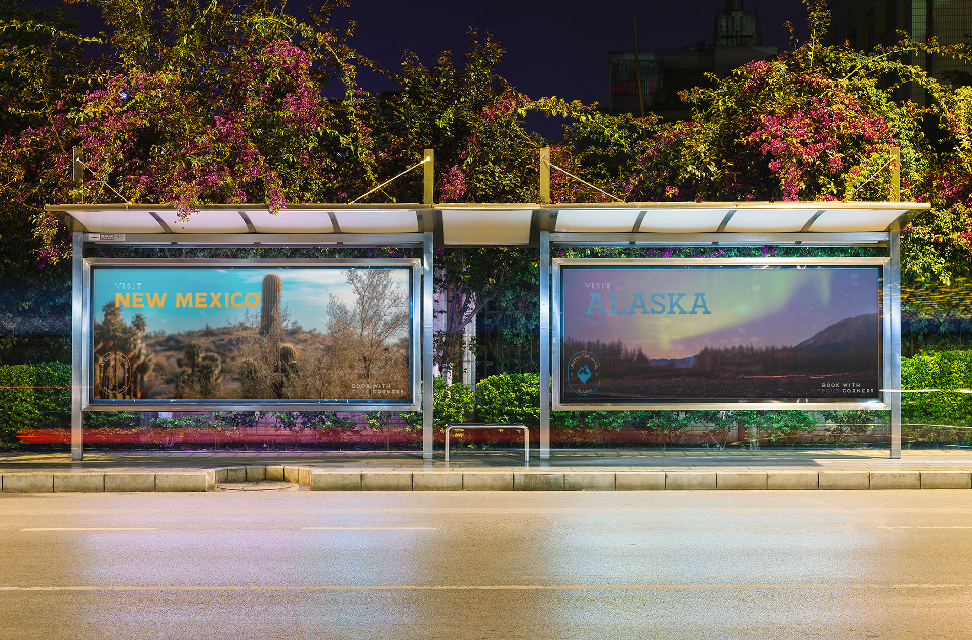
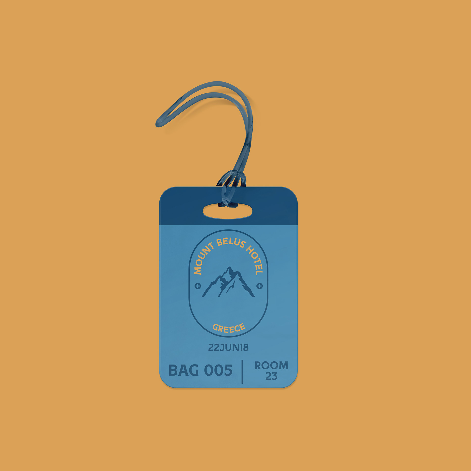
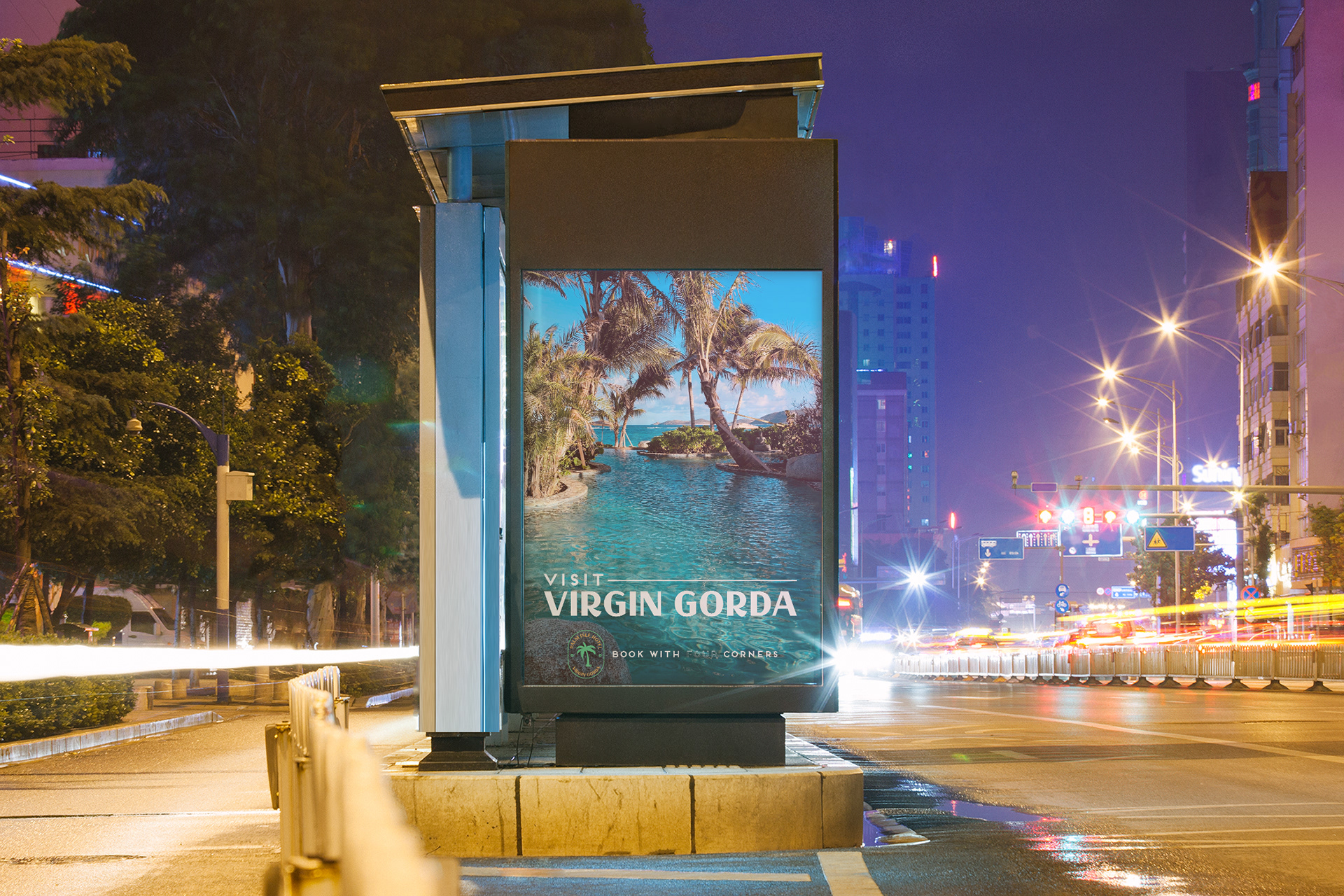
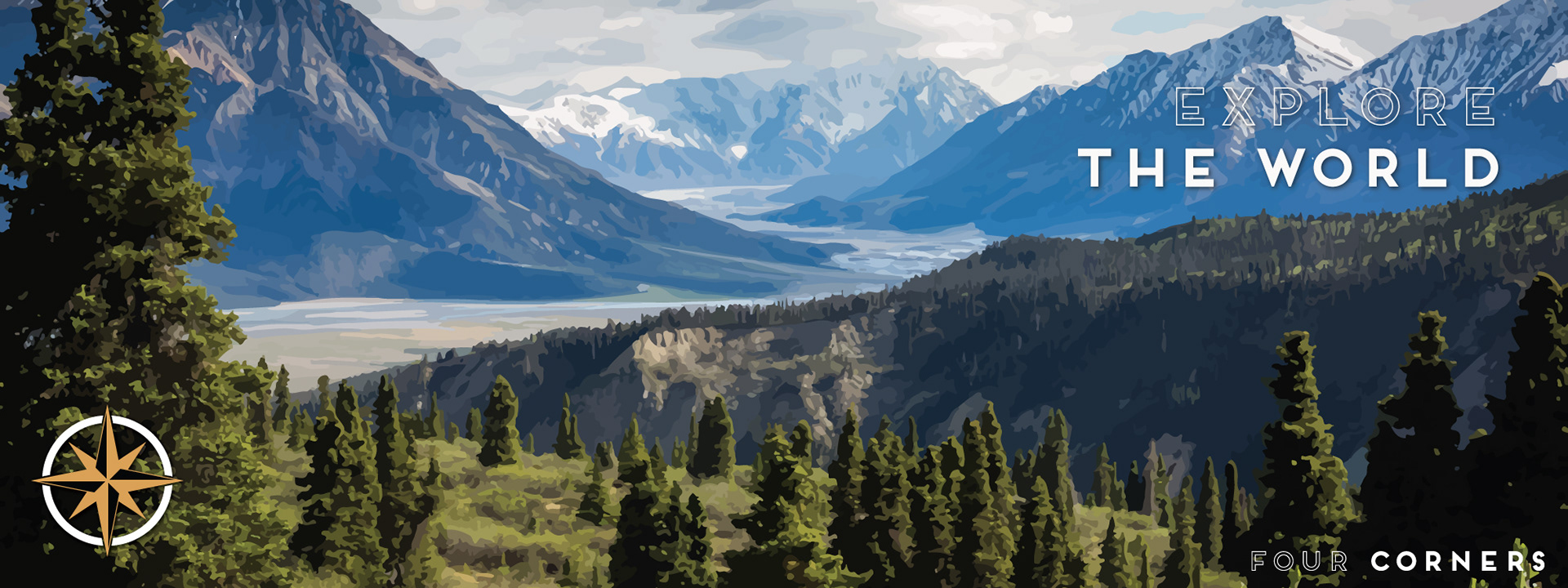
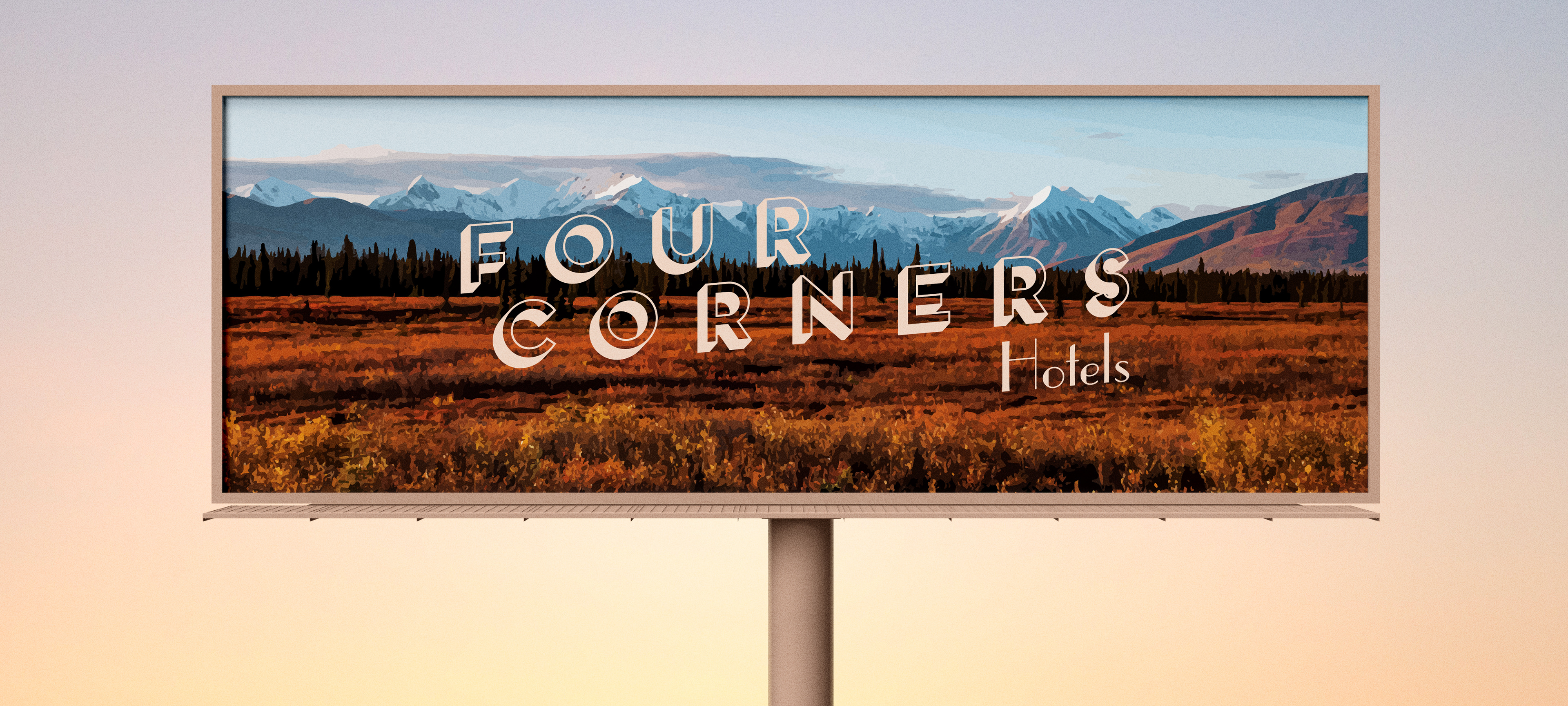
Four Corners began with the challenge of creating a single hotel brand that could adapt its identity to destinations around the world without losing cohesion. To solve that, I designed four distinct yet connected identities inspired by the Desert, Tropics, Mountains, and Arctic, developing nature‑based logos, palettes, and visual systems that captured each environment. I expanded these concepts into location‑specific services and hospitality touchpoints to show how the brand could function in real‑world applications. The result is a unified but highly adaptable hospitality system that demonstrates how thoughtful design can bring multiple destinations to life under one brand family.